We offer two ways to help you understand the solution to this query – pick whichever works best for you:
Prefer to watch? Start with our short walkthrough video that shows you exactly how it works, step by step.
Prefer to read? Scroll down for the full written guide with screenshots and detailed explanations.
Choosing the right patent attorney or law firm is one of the most consequential decisions an IP team makes. Yet most teams still rely on reputation, referrals, or gut feel – without any real data to back it up.
The Prosecutor Analysis feature in the TIP Tool™ changes that. It gives you real prosecution data on any attorney or law firm: their allowance rates benchmarked against the examiners they worked with and their art units, prosecution timelines, office action behavior, RCE patterns, and the applicants they’ve represented. You can compare up to three prosecutors side by side and filter the data to match your specific context.
With this, you stop guessing and start choosing counsel based on actual performance – in the right context.
What Prosecutor Analysis Helps You Understand
With Prosecutor Analysis in the TIP Tool™, you can:
- Evaluate allowance rates in context – See how a prosecutor’s grant rate compares to their examiners and art unit benchmarks, not just in isolation.
- Review prosecution efficiency – Understand how long cases take to grant and how many office action rounds are typical for this attorney.
- Analyze RCE behavior – See whether this prosecutor’s cases require Requests for Continued Examination, and how often those RCEs actually succeed.
- Compare office action patterns – Benchmark the prosecutor’s office action rates against their Group Art Unit averages.
- Track performance trends over time – See whether their allowance rate is improving, declining, or holding steady year over year.
- Check for potential conflicts – See which applicants they’ve worked with most, including whether they represent your competitors.
Step-by-Step: Using Prosecutor Analysis in the TIP Tool™
Step 1: Go to Prosecutor Analysis
From the top navigation bar in the TIP Tool™, click on “Prosecutor Analysis.” This will take you to the main search dashboard where you can look up any attorney or law firm.
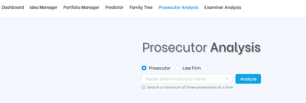
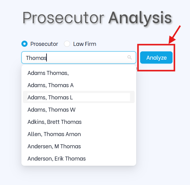
Step 2: Search for a Prosecutor or Law Firm
In the search bar, type the attorney’s name or the law firm’s name. The tool will auto-suggest matches as you type. You can start at the law firm level for a broad view, then drill down to individual attorneys for a more precise picture.
Once you see the right name, select it and click “Analyze.”
.
What You’ll See (And How to Use It)
1. Prosecutor Details
At the very top, you’ll see the prosecutor’s full identity card. This includes:
- Prosecutor name and law firm
- Prosecutor license years (e.g., More than 4 Years)
- Office address
- Phone number
- USPTO registration number
- Email (where available)
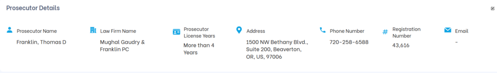
Why it matters: Before diving into performance data, this confirms you have the right person – especially when attorneys share common names or have moved between firms. The registration number is particularly useful for cross-referencing USPTO records.
2. Allowance Rate – 4-Layer Concentric Arc Chart
This is the most important section. The tool uses a four-layer concentric arc chart to show performance at four levels simultaneously:
- Outer arc – The individual prosecutor’s allowance rate
- Second arc – The prosecutor’s average GAU (Group Art Unit) allowance rate
- Third arc – The aggregated examiners’ allowance rate (examiners this prosecutor worked with)
- Inner arc – The aggregated examiners’ GAU allowance rate
The color coding on the outer arc tells you immediately how the prosecutor performs relative to their GAU average:
- Red – More than 10% below the GAU average (underperforming)
- Orange/Yellow – Within ±10% of the GAU average (performing as expected)
- Green – More than 10% above the GAU average (outperforming)
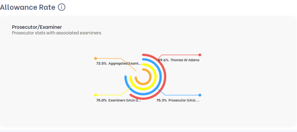
Why it matters: A number without context can completely mislead you. In the example above, Thomas D Franklin has an 88% allowance rate – shown in orange (within range). But look at what that means: the examiners he worked with have an 85% average, and his GAU average is 80.5%. His 88% is actually above both benchmarks. Without the concentric chart, you’d just see a number. With it, you see performance in context.
| 💡 Core principle: Never judge an allowance rate without comparing it to the examiner and art unit benchmarks. A 90% rate can signal exceptional skill or simply reflect an easy examiner – this chart tells you which it is. |
3. Prosecutor Profile Table
This table gives you a full head-to-head comparison across four columns: the prosecutor, their Group Art Units, the aggregated examiners they worked with, and those examiners’ GAUs. For each, you see:
- Total Applications
- Granted Patents
- Allowance Rate (with color-coded performance badges: Impressive, Average, Below Average)
- Abandoned/Rejected Applications
- Pending Applications
- Average Grant Time
- Average Office Actions
Below the table, the tool generates a plain-English narrative summary that ties the numbers together – explaining how the prosecutor’s performance relates to their examiners and GAU context.
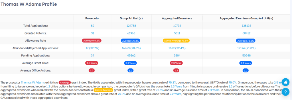
Use Case: This is where you size up a prosecutor’s complete track record at a glance. In the example, Thomas D Franklin’s 1.5-year average grant time and 0.8 average office actions are both significantly better than the GAU average of 2.1 years and 1.1 office actions – a strong signal of prosecution efficiency.
4. Issuance Time & Office Actions + Group Art Units
This section has two parts. The top table gives you precise timing and office action data comparing the prosecutor directly against the examiners they worked with:
- Time for Issuance – Shortest, Average, and Longest (prosecutor vs. examiners)
- Office Actions Before Issuance – Least, Average, and Most (prosecutor vs. examiners
Below that, a bar chart shows the Group Art Units this prosecutor has worked in most frequently, with a breakdown table on the right showing their allowance rate in each GAU.
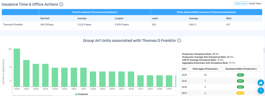
Why it matters: This section helps you set realistic expectations before you engage a prosecutor. If their average grant time is 1.5 years against examiners who typically take 2.0 years, that’s a meaningful efficiency advantage. The GAU breakdown also confirms whether their experience and performance are concentrated in the specific art unit relevant to your case.
| Use Case: If you’re managing a tight prosecution budget or working toward a product launch timeline, a prosecutor who consistently resolves cases in fewer office action rounds and shorter timelines has a direct impact on your costs. |
5. Request for Continued Examination (RCE) Trend
This section shows how often the prosecutor’s cases required a Request for Continued Examination – and whether filing an RCE actually helped. The pie chart breaks down granted applications by:
- No RCE required
- 1 RCE filed
- 2 RCEs filed
- 3 or more RCEs filed
On the right, you’ll see the key outcome stats: what percentage of applications that went through an RCE were ultimately abandoned or rejected, how often the first RCE led to an immediate notice of allowance, and the average number of RCEs filed per application.
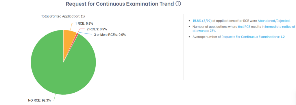
Why it matters: A prosecutor who gets 92.3% of cases granted without ever needing an RCE is handling prosecution efficiently upfront. But the more telling stat here is that when an RCE is filed, 78% result in immediate allowance – a high success rate. Compare this to a prosecutor where most RCEs lead to abandonment, and you’re looking at a very different risk profile.
| 💡 RCEs cost time and money. A prosecutor with a low RCE rate and a high RCE success rate is managing prosecution efficiently – fewer wasted cycles, lower legal costs. |
6. Time Between a Response & Office Action
This section shows how quickly the prosecutor typically responds after receiving a rejection, and how that compares to the examiners they work with. You’ll see two side-by-side bar charts:
- FR (Final Rejection) – Minimum, average, and maximum response turnaround times for the prosecutor vs. their examiners
- NFR (Non-Final Rejection) – Same breakdown for non-final rejections
The right-side stats show additional context: what percentage of cases were granted without any Final Rejection, what percentage involved both FR and NFR, and the average number of each rejection type per application.
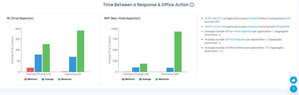
Why it matters: One of the most common questions IP teams get from inventors is: “We just responded – when can we expect to hear back?” This section lets you answer that with data. If the average response time after an NFR is around 80 days for this prosecutor, you can set that expectation clearly, rather than leaving stakeholders in the dark.
| ✅ Use this data to manage internal timelines, set client expectations, and avoid surprise delays during prosecution. |
7. Allowance Trend
This bar chart shows how the prosecutor’s grant behavior has changed year over year. Each year displays three bars:
- Green – Granted cases
- Red – Abandoned cases
- Blue – Pending cases
Use the toggles at the top right to switch between Filing Year (how cases filed in a given year eventually resolved) and Grant Year (when patents were actually issued). You can also switch between Value (case counts) and Percentage views.
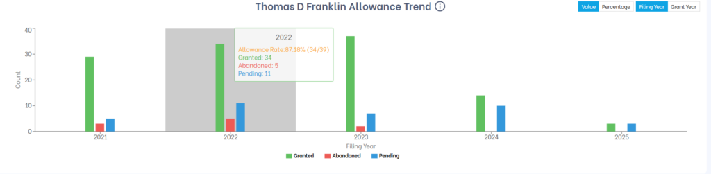
Why it matters: Historical averages can hide recent shifts in performance. A prosecutor whose allowance rate was strong five years ago may be struggling today – or vice versa. The trend chart lets you spot whether performance is rising, declining, or consistent, and gives you a longer-view perspective before committing.
| 💡 Tip: Switch to Grant Year to understand how many patents this prosecutor actually got issued in recent years. Switch to Filing Year to track the outcomes of a specific batch of cases over their full lifecycle. |
8. Office Actions – Prosecutor vs. Group Art Unit
This section shows two side-by-side bar charts comparing how the prosecutor’s cases are handled versus how the broader Group Art Unit handles them. For each, you see the percentage of applications that received:
- No Office Action
- Non-Final Rejection (NFR)
- Final Rejection (FR)
Click on any bar to drill down further – for example, clicking the NFR bar will show how many applications received 1, 2, or 3+ non-final rejections.
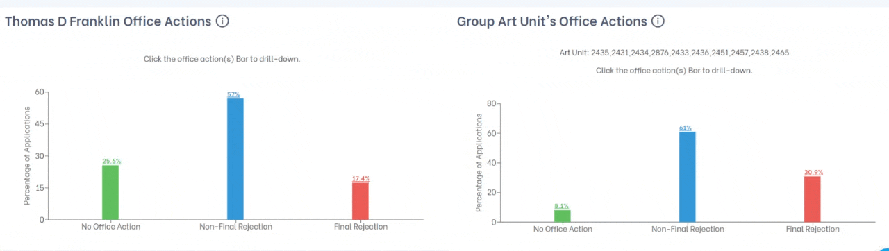
Why it matters: The comparison reveals prosecution difficulty in context. In the example above, Thomas D Franklin’s Final Rejection rate of 17.4% is notably lower than the GAU average of 30.9% – meaning his cases are significantly less likely to face a final rejection than typical cases in those art units. That’s a meaningful prosecution advantage.
| Use the drill-down: Click on the NFR bar to see how many rounds of non-final rejections are typical. If most cases resolve after 1 NFR, that’s a very different prosecution profile than one where 2-3 rounds are common. |
9. Office Actions Trend
This pie chart breaks down how many total office actions (Final + Non-Final Rejections combined) were involved in the prosecutor’s granted cases:
- No Office Action
- 1 Office Action
- 2 Office Actions
- 3 or More Office Actions
The right-side stats show the percentage of cases in each category, average days to allowance for each track, and how many cases were granted without any office actions at all.
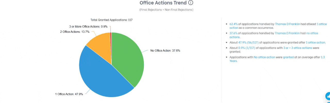
Why it matters: Nearly 38% of this prosecutor’s cases get granted with zero office actions – a strong indicator of well-drafted applications that pass examination cleanly. Another 48% resolve after just one round. That means over 85% of cases close within a single office action cycle, which directly translates to lower legal costs and faster timelines for you.
10. Popular Applicants
This section shows the companies and applicants the prosecutor has represented most frequently. A bar chart shows case volume per applicant, and a table on the right lists each assignee with their total applications and the prosecutor’s allowance rate for their cases specifically.
Summary stats at the top show the maximum applications in any single year, the top 3 applicants over the past 5 years, and the highest-volume applicant with a 100% allowance rate.
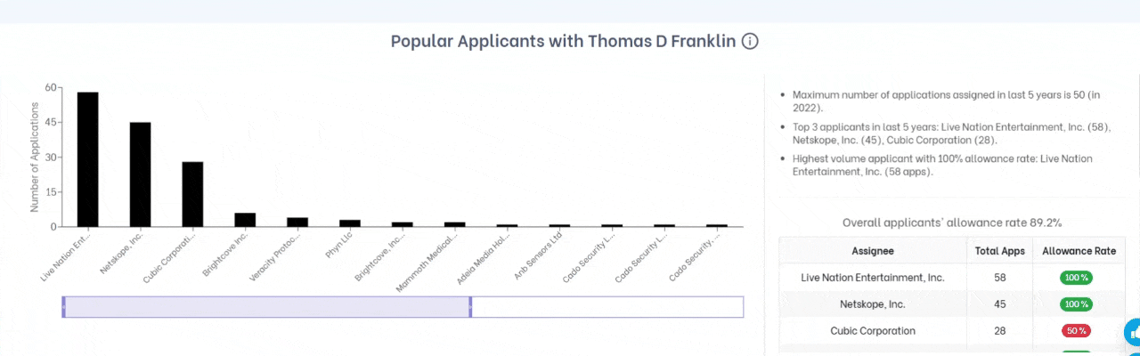
Why it matters: This section serves two purposes. First, it shows who the prosecutor’s real clients are – experience with Live Nation Entertainment’s IP portfolio is very different from working with early-stage startups. Second, and critically, it’s a conflict check. If a prosecutor regularly works with your direct competitors, that’s something you need to know before engaging them.
| Conflict check tip: Look for any applicants that overlap with your competitors or companies in adjacent spaces. Even if there’s no formal legal conflict, a prosecutor deeply embedded with a competitor may not be the right choice. |
How to Read the Data: A Few Important Reminders
Prosecutor Analysis gives you powerful data, but context always matters. Keep these principles in mind:
- Benchmark comparisons are essential. Never judge an allowance rate without comparing it to the examiner and art unit averages. The concentric arc chart exists precisely for this reason.
- Lower stats don’t always mean worse performance. Attorneys who take on complex technologies, contested claims, or difficult examiners may show lower allowance rates as a result. The data gives you context to ask better questions – not a final verdict.
- Volume matters. An attorney with a very small number of cases in your area may not have enough data to draw reliable conclusions from. Look for meaningful sample sizes before committing.
- Recent activity is a useful signal. Someone with a strong historical record but very little recent activity may not be actively taking new work. Use the Advanced Search filters to focus on recent filings and current caseloads.