We offer two ways to help you understand the solution to this query — pick whichever works best for you:
Prefer to watch?
Start with our short walkthrough video that shows you exactly how it works, step by step.
Prefer to read?
Scroll down for the full written guide with screenshots and detailed explanations.
Managing a patent portfolio can quickly become overwhelming. Especially when you’re dealing with hundreds of applications at different stages of prosecution, across multiple examiners and law firms.
That’s why the Portfolio Manager in the TIP Tool™ includes two powerful visualizations right at the top:
- Status Distribution Chart
- Prosecution Efficiency Scatter Plot
Together, these charts give you a birds-eye view of your portfolio’s health and help identify where applications are stalling — so you can take informed action, fast.
Where to Find These Charts
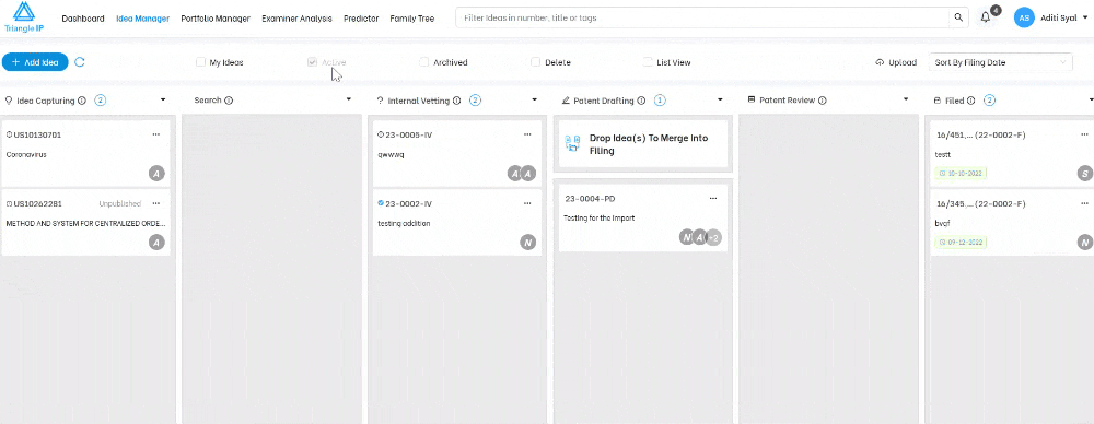
Step 1: Log into the TIP Tool™
Step 2: Choose any portfolio from your list
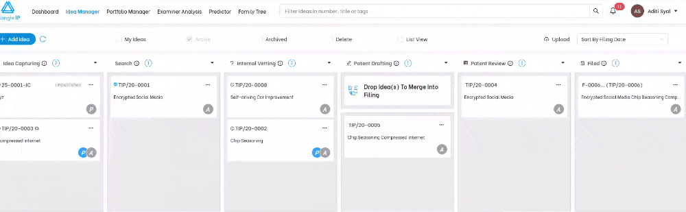
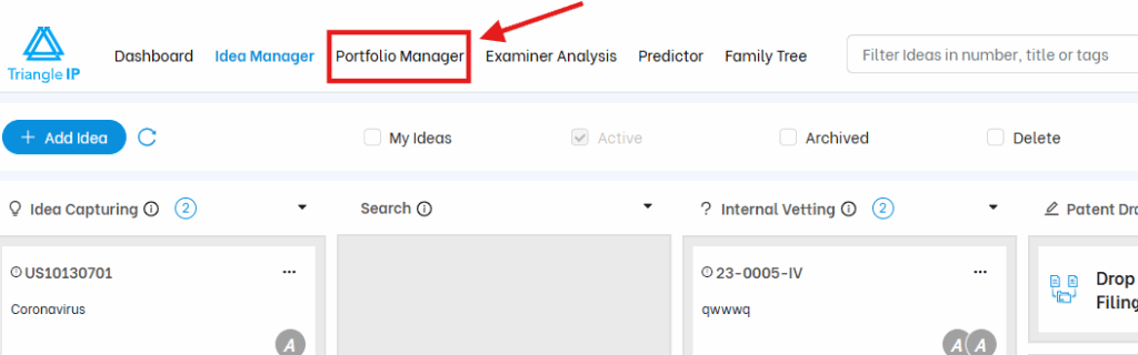
Step 3: Go to the Portfolio Manager tab
Step 4: The visual graphs will load automatically at the top of the page
These charts are auto-generated and updated in real-time based on the most recent data synced from the USPTO (via Private PAIR).
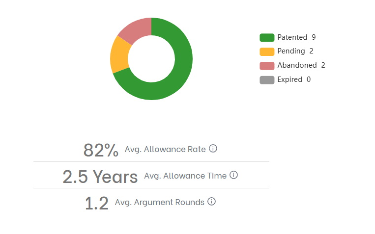
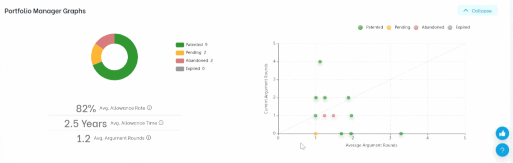
Graph 1: Status Distribution Chart (Donut Chart)
This chart breaks your patent portfolio into five high-level status categories:
| Status | Meaning |
| 🟩 Patented | Applications that have been granted |
| 🟨 Pending | Still under USPTO examination |
| 🟥 Abandoned | Discontinued or rejected without appeal |
| ⬛ Expired | Patents that have reached the end of term |
Click on any slice to filter your portfolio and view the corresponding applications below.
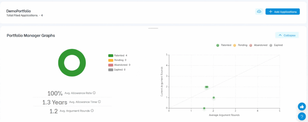
Pro Tip: This gives you a quick status snapshot across all your filings. Are too many applications getting abandoned? Are enough being granted? This chart helps answer that at a glance.
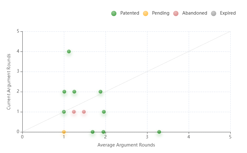
Graph 2: Prosecution Efficiency Scatter Plot
This is where things get really interesting.
This 2×2 scatter plot maps every granted (or pending) U.S. application in the portfolio based on two factors:
- X-axis: Examiner’s average number of rounds to grant
- Y-axis: The actual number of rounds your application went through
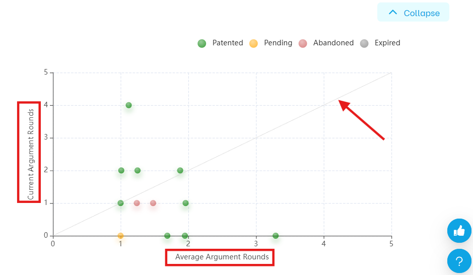
Each dot = one application
Dot color = filing status (e.g., green means granted, yellow means pending, read are abandoned)
How to Read the Chart
There’s a diagonal line across the chart.
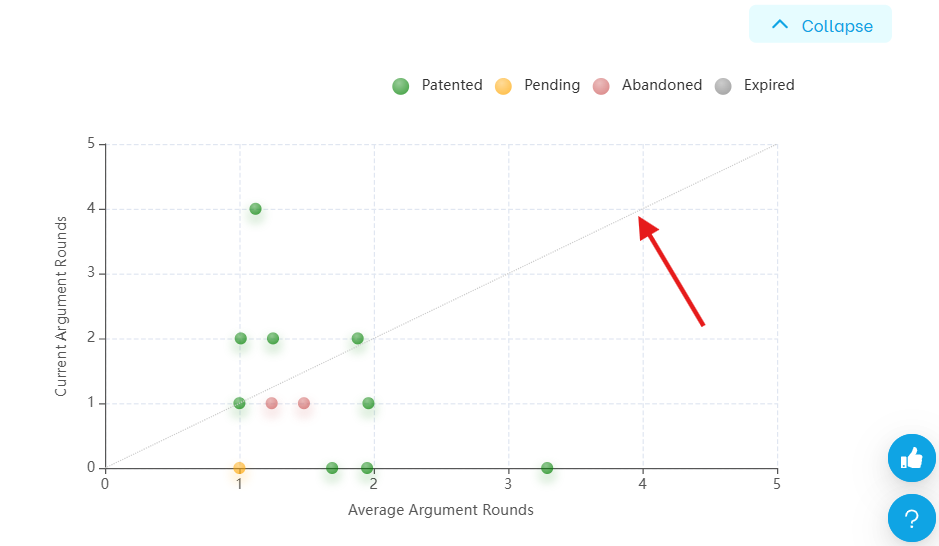
It represents parity between your prosecution and the examiner’s average.
- 🔼 Dots above the line = your application took more rounds than average (potential red flags)
- 🔽 Dots below the line = your team got the grant faster than average (great performance)
Click Any Dot to Investigate Further
When you click on a dot, it automatically brings that case in the list as you scroll down to the full case record.
From there, you can further open the application and review:
- The examiner assigned
- Argument history
- Office actions
- Predicted vs. actual cost
- Whether the delay was due to examiner, counsel, or claim strategy
Common Use Cases:
| What You Want to Know | What to Look For |
| Are some applications dragging on longer than they should? | Look for pending dots above the diagonal |
| Which filings had smoother prosecution than average? | Find granted dots below the diagonal |
| Are your attorneys doing a good job? | Check how filings compare to examiner averages |
| Is the examiner slow or strict? | Use the X-axis to assess average difficulty |
Final Thoughts
The Portfolio Manager charts are more than just data visualizations — they’re strategic dashboards. They help IP teams and decision-makers:
- Spot patterns
- Catch inefficiencies early
- Allocate resources smartly
- Make better filing, pruning, or continuation decisions
Use them during portfolio review meetings or when reporting to R&D or executive teams. Once you get used to this two-graph interface, you’ll never go back to static spreadsheets again.