We offer two ways to help you understand the solution to this query — pick whichever works best for you:
Prefer to watch?
Start with our short walkthrough video that shows you exactly how it works, step by step.
Prefer to read?
Scroll down for the full written guide with screenshots and detailed explanations.
Getting a patent approved isn’t just about what you write, it’s also about who’s reviewing it. Once your application is filed, it goes to a USPTO examiner. Some examiners approve patents more often and faster. Others are slow, strict, or rarely grant anything at all.
The Examiner Analysis feature in the TIP Tool™ helps you understand the person reviewing your application, their past decisions, how tough they are, how long they usually take, and how many rejections they give before granting anything.
Knowing this upfront means you’re not going in blind. You can plan better, respond smarter, and even decide if it’s worth continuing or stop moving ahead with that application.
What Examiner Analysis Helps You Understand
With Examiner Analysis in the TIP Tool™, you can uncover key patterns such as:
- Allowance Rates – How often the examiner grants patents compared to others
- Office Action Behavior – How many rejections they usually issue before approval
- Time to Grant – How long it typically takes to get through the process
- Technical Domain – Whether they specialize in your invention’s area
Understanding these factors means you can:
- Adjust your patent strategy before it’s too late
- Choose whether to revise, interview, or appeal
- Better estimate costs and timelines for legal review
Step-by-Step: Using Examiner Analysis in the TIP Tool™
Step 1: Go to the Examiner Analysis Tab
From the top navigation bar in the TIP Tool™, click on “Examiner Analysis.”

This will take you to the dashboard where you can search for individual USPTO examiners.
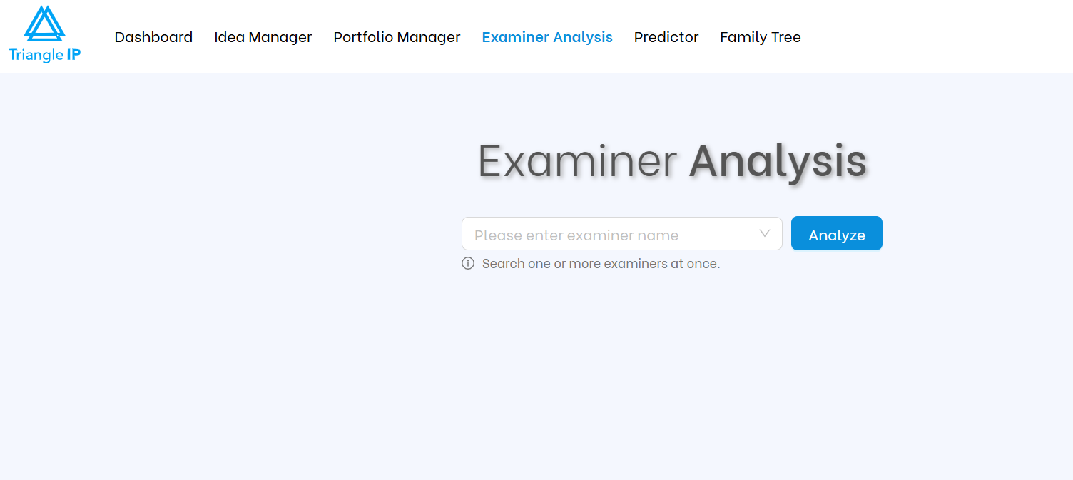
Step 2: Search for an Examiner
In the search bar, begin typing the examiner’s name (e.g., “Janice”), and the tool will auto-suggest matches as you type.
Once you see the correct name, select it and click “Analyze.”

Also, check How to Do Advanced Search of Examiners?
What You’ll See (And How to Use It)
Once the profile loads, the page is divided into multiple data blocks. Here’s how each part can guide your prosecution strategy:
1. Allowance Rate Comparison (Examiner vs GAU vs USPTO)
At the top, you’ll see circular progress charts showing:
- Examiner’s personal grant rate
- Average for their Group Art Unit(s)
- USPTO average
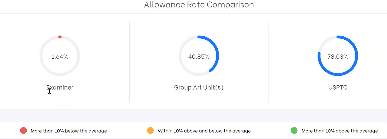
At the bottom, you’ll see color legends indicating how the examiner’s allowance rate compares to their Art Unit average: red (more than 10% below), yellow (within ±10%), and green (more than 10% above). In layman’s terms, red means much stricter, yellow means typical, and green means more generous.
Why it matters
If your examiner’s grant rate is much lower than their GAU or the USPTO average, expect a tougher road ahead i.e., more rejections, delays, or appeals may be needed.
2. Examiner Profile Table
This section gives you a quick but powerful snapshot of how your examiner behaves in prosecution.
You’ll see:
- Total Applications handled
- Granted vs Abandoned counts
- Grant Index (how this examiner compares to USPTO averages)
- Average Grant Time
- Avg. Office Actions Before Grant
- In-Process Cases
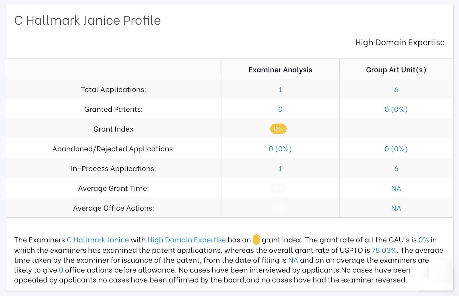
Use Case: This is where you size up your examiner’s temperament. Have they only granted a handful of cases in their career? That could indicate a near-impossible path (as with Janice Mooneyham 98% abandonment rate).
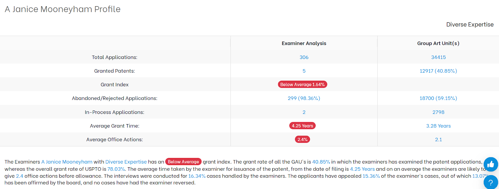
If an examiner usually issues several rejections before granting a patent, it means you’ll likely face more back-and-forth which can lead to longer timelines and higher legal costs.
This table helps you decide whether to stay the course, push harder, or cut your losses early.
3. Examination Pattern Tree
This interactive visual maps out how applications examined by your selected examiner typically play out. It’s a decision tree built from real historical data.
Here’s what it shows:
- Granted – How often the examiner allows a case
- Abandoned – How many applicants give up after office actions
- In-Process – What’s still pending

Click on any step in the decision tree (called a node) to view what typically happens next. For example, if most applications receive a Final Rejection at that point, the tool will show whether applicants commonly requested a continuous examination, chose to abandon the application, or ultimately secured a grant.
You can double-click on any node to go deeper into the examination history.
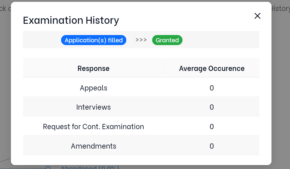
| Important: This won’t predict your exact outcome. But it helps you learn from real patterns so you can make better decisions. If you’re wondering, “What’s likely to happen next?” This is where you find that answer. |
4. Time for Issuance + Office Actions
This panel gives you a clear sense of how quickly (or slowly) the examiner tends to move applications forward, from first filing to final decision.
You’ll see key insights like:
- Shortest, Average, and Longest Time to Grant
Know the range as some examiners are lightning-fast, others take years. - Average Number of Office Actions Before Allowance
Shows how many back-and-forth rounds you might expect.
Why This Matters
This data helps you plan ahead whether you’re managing internal legal workflows, budgeting attorney time, or setting expectations for inventors and stakeholders. A higher number of office actions means more rounds of argument, and longer timelines could affect product launches or enforcement windows.

Use Case: Helpful for forecasting internal timelines, legal resource needs, and budgeting expectations.
5. Group Art Units Associated with Examiner
This section shows which Group Art Units (GAUs) the examiner has worked in and how their allowance rate changes with each GAUs.
At the USPTO, every examiner is assigned to one or more GAUs — teams organized by technical domain (e.g., software, biotech, mechanical). Each GAU has its own average allowance rate and prosecution practices, often influenced by the supervisory structure and the complexity of the subject matter.
What You’ll See
- GAU: The number representing the examiner’s work area (e.g., 3689).
- Total Apps: How many applications the examiner reviewed in that GAU.
- Allowance Rate: The percentage of those applications they approved.
For example, if an examiner allowed only 1.27% of applications in GAU 3689 but 2.38% in GAU 3629 that might tell you they’re slightly more flexible in GAU 3629.
6. Request for Continued Examination (RCE) Trend
This section shows how often applicants had to file an RCE to keep prosecution going and whether doing so actually helped with getting a grant.
What’s an RCE?
A Request for Continued Examination (RCE) is filed when you want the examiner to take another look after a Final Office Action essentially buying another round of review.
What This Chart Tells You
- The pie chart shows how many granted applications involved:
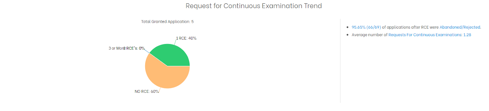
- In this example above, 60% of the granted cases didn’t need an RCE, while 40% needed one.
To the Right:
- A failure rate of 95.65% of applications filed with an RCE were ultimately abandoned or rejected i.e., a red flag for continuing.
- Average number of RCEs filed per application: Helpful to understand how far most applicants had to push.
Why This Matters
If an examiner has a high RCE rejection/abandonment rate, it might not be worth pursuing after a final rejection. You can weigh whether to:
- Proceed with an RCE (extra cost, time)
- Appeal instead
- Consider abandoning
Use this data to avoid wasting cycles and budget on strategies that historically haven’t worked with this examiner.
7. Allowance Rate by Prosecution Method (Interviews, Appeals, RCEs)
This section shows the number of cases granted vs. abandoned, broken down by key prosecution strategies:
- Interviews
- Appeals
- Requests for Continued Examination (RCEs)
What You’ll See
- Bar chart showing how often each method was used
- How successful they were (green = granted, red = abandoned)
- Key time metrics on the right:
- Time from filing to first office action
- Time from first office action to allowance
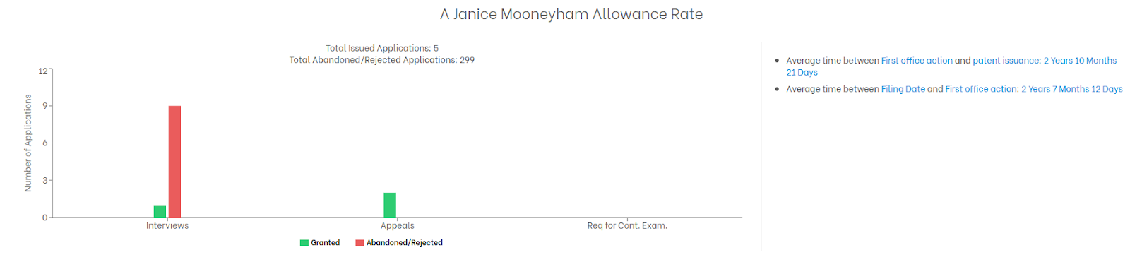
Why It Matters
Not all strategies work equally with every examiner. In some rare cases, interviews may lead to a breakthrough but not always. With data like this, you can avoid wasting time and money on tactics that simply don’t work for this examiner.
👉 If appeals are the only route that’s led to grants, you’ll want to keep that option open early in your strategy.
8. Time Between a Response & Office Action
This chart shows how long your selected examiner typically takes to respond after you’ve submitted a reply (like after a non-final or final rejection).
What You’ll See
- Bars showing the minimum, average, and maximum number of days it took the examiner to respond
- Data for both:
- Non-Final Rejection (NFR)
- Final Rejection (FR)
- Summary stats on the right (e.g., average number of NFRs/FRs issued per application)
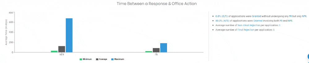
Why It Matters
To answer of the most common client questions:
“We just filed a response so now when can we expect to hear back?”
Now you can answer that with data. If the average time to respond after an NFR is 84 days, you can realistically set expectations internally or with your client.
| ✅ Use this to manage timelines and avoid surprise delays during prosecution. |
9. Allowance Trend Graph
This bar chart shows how your examiner’s grant behavior has changed over the years. Giving you a long-view perspective before you respond or appeal.
You’ll see:
- Green: Granted Cases
- Grey: Abandoned Cases
- Blue: Pending Cases
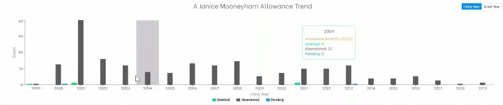
Use the toggle to switch between “Filing Year” and “Grant Year”. This comes as a handy way to track whether the examiner is becoming more or less lenient in recent years.
Why This Matters
If an examiner’s allowance rate is rising, you might take a more optimistic approach. If it’s declining or volatile, be prepared for delays, extra rounds, or even appeals. Knowing these trends helps you set the right expectations and strategy upfront.
10. Appeal Cycles
This panel gives you a clear view of how often applicants go into the USPTO appeal process with this examiner and how far they make it.
What You’ll See
A branching diagram showing:
- Notice of Appeal Phase
- Pre-Appeal Conference Phase
- Appeal Brief Phases (1 and 2)
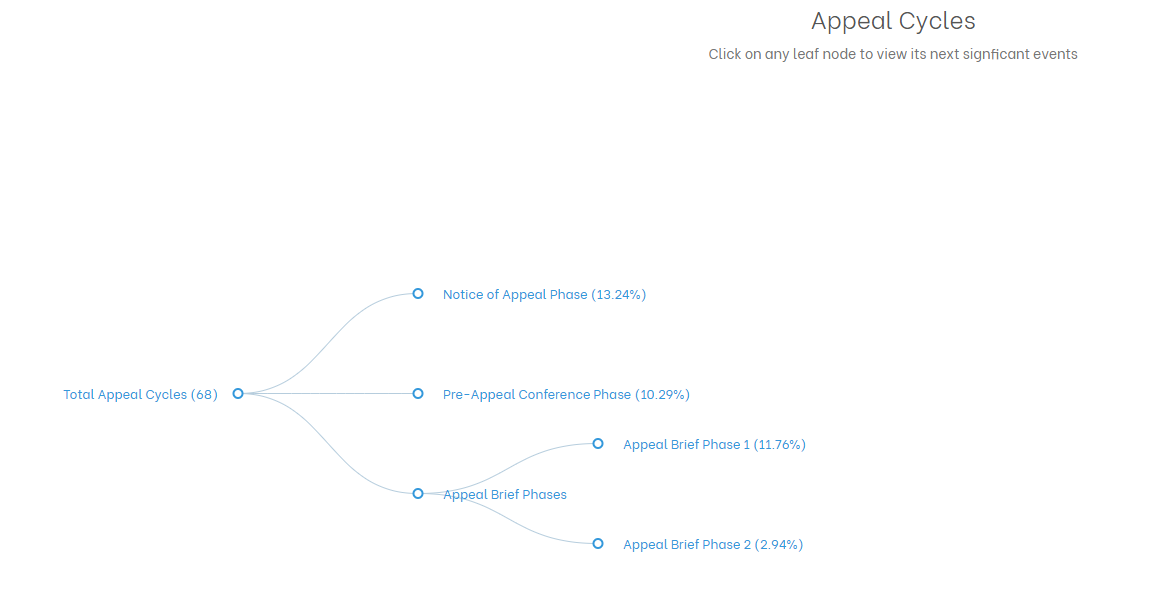
Each path shows the percentage of cases that followed that route, offering a visual breakdown of procedural momentum.
Why It Matters
It tells you how resistant or receptive an examiner may be to appeals. If few applications progress beyond early stages, it may suggest they’re tough to budge. If many succeed deeper into the appeal cycle, it’s a sign that persistence may pay off.
12. Pre-Appeal Brief Conference
Before going into a full appeal (which is time-consuming and costly), applicants can request a Pre-Appeal Brief Conference. That is a quick review by the examiner and two supervisors to see if the rejection should stand.
What You’ll See in the TIP Tool™:
A simple chart that shows how often this examiner:
- Reverse the rejection (you win early!)
- Stood by the rejection (you move forward to appeal)
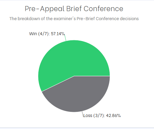
Why It Matters
This tells you whether it’s worth trying this shortcut. If the examiner often reopens prosecution at this stage, it might be a smart move to avoid a full-blown appeal.
13. Appeal Brief
This section shows what happens when applicants skip the pre-appeal or lose there — and file a full Appeal Brief before the Patent Trial and Appeal Board (PTAB).
What You’ll See
- Percentage of cases where the appeal succeeded
- Percentage of cases where the examiner’s rejection was upheld
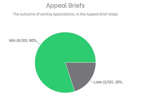
Why It Matters
If the examiner tends to lose on appeal, it could be a strong signal that challenging their rejection is worth it.
14. Examiner vs. GAU: Office Action Trends
This view compares how your examiner handles Office Actions versus how their Group Art Units (GAUs) handle them.
You’ll see two sets of charts:
Examiner’s Behavior:
Shows what percentage of their applications receive:
- Non-Final Rejections
- Final Rejections
- No Office Action
GAU Behavior:
Displays the same categories but averaged across the entire GAU (the examiner’s peer group).
Now if you click on any bar, it will drill down into how many times they’ve issued 1, 2, or 3+ Non-Final Rejections (shown as CTNFs).
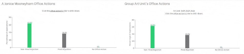
Why This Matters
If your examiner issues significantly more final rejections or multiple CTNFs than their peers, you may be in for a tougher prosecution. On the flip side, if they’re more lenient, it could signal faster resolution or a lower-cost path forward.
This side-by-side comparison helps you anticipate prosecution complexity and adjust your strategy accordingly.
15. Office Actions Trend
This panel breaks down how many Office Actions (Final + Non-Final) an examiner typically issues before allowance.
You’ll see a pie chart showing:
- Applications allowed after 1 Office Action
- After 2 Office Actions
- After 3 or more
On the right, you’ll find helpful stats like:
- % of cases granted after 1 vs. 2 vs. 3+ rounds
- Average days to allowance for each track
- Whether any were granted without office actions
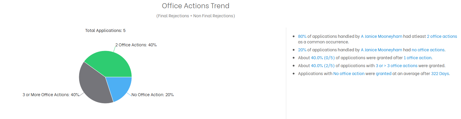
Why This Matters
If most allowances happen after multiple rejections, be ready for a longer, more resource-intensive prosecution. But if your examiner tends to allow quickly (e.g., after 1 CTNF), that’s a sign of smoother proceedings.
16. Popular Attorneys with This Examiner
This chart shows who’s worked most often with the examiner. Typically large organizations or repeat filers.
You’ll see:
- A bar graph of top applicants
- A table with:
- Total applications per applicant
- Their individual allowance rate with this examiner
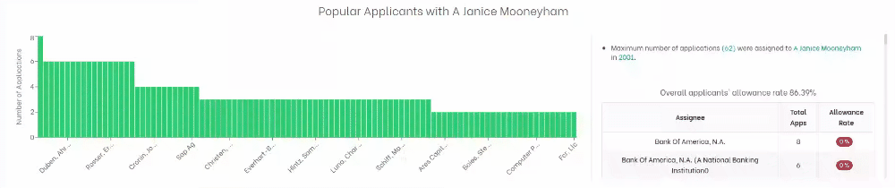
Use Case
If you see an organization like Bank of America with dozens of applications but a 0% success rate, it’s a red flag. This info helps you spot institutional trends — or see if the examiner seems tougher on particular applicants.
17. Popular Attorneys with This Examiner
This final panel shows the law firms or counsel who’ve most frequently appeared before this examiner.
What you’ll find:
- Total applications per attorney
- Their allowance rates
- At-a-glance comparisons across firms
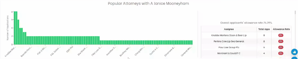
Why It’s Useful
If you’re evaluating external counsel or benchmarking internal teams, this data tells you who’s had success (or not) with the examiner you’re facing. If one firm has consistently secured allowances, it may be worth learning from their approach or even reaching out.